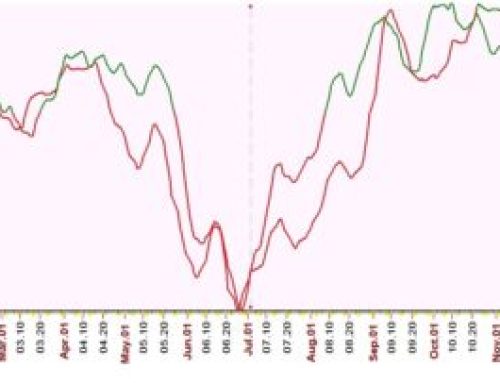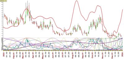
In the enclosed graph you can see a red thick line & red-green candle bar ,
this is comparative chart of vix for year 2023 ,
red thick line was the forecast and red-green bars are the real time of vix for year 2023
It was not 100% but good enough to catch every move of vix in year 2023
Hope you find this useful
Best wishes